Monday, April 15, 2013

Wild One

Just a quick post for now. Here's the process for an image with the word inspiration 'Wild'. As usual I went through a lot of ideas of what to do for this. An animal? A Primitive human? A scary creature from another planet?

Last night I watched a movie called 'The Ward' and that's where I drew my inspiration for this project.

http://ipwalls.com/wp-content/uploads/2011/07/John-Carpenter’s-The-Ward.jpg

My concept was a person in a straight jacket going crazy and trying to get out. I started with my usual pencil sketch.

Wild Sketch

Next I traced over with Prismacolour markers and ink. I wanted it to have a messy, rushed, 'wild' look to it.

Wild Colour

After finishing with the markers and ink I used Photoshop to increase the contrast and brighten the colours. I used hue/saturation, and contrast layers, and a sharpening and high pass filter.

WildFinal

And there we have a wild drawing of a wild man.

"A man without ethics is a wild beast loosed upon this world." Albert Camus

Don't Eat This Egg

Hello again,
and welcome back to the interwebs!

The word of the week is Egg. Being that I love video games, this was actually a very interesting concept for me, because eggs have nothing to do with video games, but I have made it my mission to persevere to design video game concept art from my inspiration words.

My first idea was to make a war hammer with an egg as the actual hammer piece. This is as far as I got:

Egg-weaponry

By the time I got to this point I hated how it looked, and began to think of 'egg' in other terms. What better way to completely screw around with the concept of something as harmless and innocent as an egg, than to turn it into a horrifying monster that looks like it'll eat you first? So that's what I did.

I started off with a sketch I made in about an hour or so. I tried to make it look really dark with the shading to get that really evil kind of essence.

Egg

Afterwards I traced over the original sketch with pen on marker paper. At this stage it was really just the lines and overall image I was trying to capture

Egg2

Next I added some more depth with my pen by filling in the darker areas like the mouth opening. I also made some lines thicker to show shading

Egg3

After letting the ink dry I started adding colour with my Prismacolour markers. As it was still meant to be an egg I knew I needed a colour that wasn't quite white, but still light enough for it to be recognizable as an egg. I actually ended up using skin tone, slightly peachy. The dirt was just a couple shades of brown at this point.

Egg4

I continued adding colour to the entire image until it was completely covered, then followed up with more layers of colour on top to get depth and shading, alternating between using darker shades of the same colours and layers of grey. I finished off by adding a few more sketch lines with my pen to really emphasize the darker areas.

Egg5

After completing the final physical image I brought it into Photoshop to increase the contrast, hue/saturation, and gave it a sharpening, sharpened edge, and high pass filter. The finished product turned out closer to what I had in mind than I had imagined possible.

EggFinalEdited

So the next time you eat eggs, remember how terrifying it could have been. Breakfast seems so nice and peaceful, and then -BAM! Egg monster!

But not today! Have a good one, until next time I bid adieu.

"Boredom is the dream bird that hatches the egg of experience. A rustling in the leaves drives him away." Walter Benjamin

Wednesday, March 20, 2013

Eye Glasses - Updated

Hello again out there!
This week's word of choice was actually 2 words- eye glasses. My first thought to tackle this concept was a post-apocalyptic gas mask. I'm not really sure why, but I've always loved the look of classic gas masks.

My Inspiration, I must say, would probably be taken from an hilarious and really beautiful web comic I follow called Romantically Apocalyptic. I love the dull and almost sickly look of the world, contrasted here and there with really great pops of colour. The story is also incredibly entertaining!

GasMask2

This subject to me seemed to make the most sense if sketched with regular graphite pencil on a page of my sketchbook. I have no real process work to show because it was pretty much done in one shot on my way home today. Waiting for busses to whisk me away, I sat at benches and drew away.

After a couple weeks away from it I decided to finish it off with ink, markers, and coloured pencils. My next step I traced over the entire image onto marker paper with my markers and ink

GasMask2

After that I decided to try to blend some of the areas and and slightly more contrast with coloured pencils.

GasMask3

Finally I took a picture of the finished image and edited in Photoshop to improve the brightness, sharpness, and contrast.

EyeGlassesFinal

And there you have it! My impression of the word(s) eyeglasses. A fairly sickly looking gas mask. I was given a great compliment by my sister when she saw it. Her response was "That's cool, it looks like something from one of those video games". And my day was made! Something I designed as video game concept art really did look like something from a video game! “This is the way the world ends Not with a bang but a whimper.” ― T.S. Eliot

Sunday, March 10, 2013

Harpy Lady- Concept design Updated

Hello again out there! Thanks for coming to check up on me, it's well appreciated :D I have some more work to show on my latest concept.

The word of choice this time around was wings. Right away many different concepts came to mind, angels, flying crafts, but mostly monsters. I love designing monsters, it's much more liberating to create something ugly than to strive for serene and beautiful. There is a lot of beauty to be found in that which is deemed unattractive though, so it's a lot of fun to work towards that goal of making it visible to people.

Finally deciding on the concept of a harpy I drew up some sketches and scrapped most of them, but eventually came to this line work.

Harpy lines

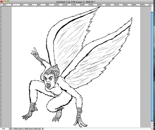
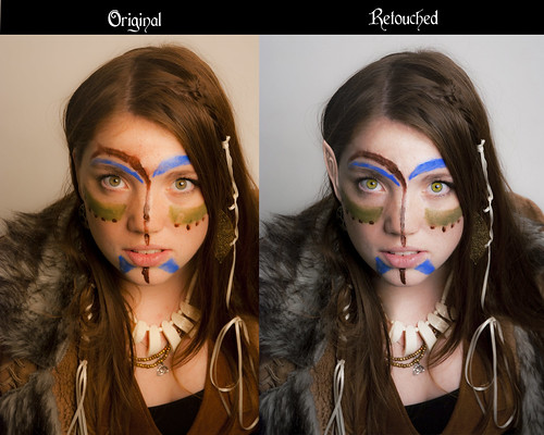
After I worked around with colours for the wings and the skin tone, because harpies have been designed in many different palettes and styles, I tried comparing the image with and without the black lines.

Harpy-2

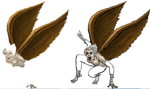
Clearly the image would look much better without the black lines surrounding it. So I continued along with that in mind, trying to create more contrast in my colours.
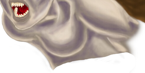
Adding in more to the facial features, including dark, high contrast eyebrows, I then moved towards the hair.

Harpy 3

I knew I wanted it to look like a cross between feathers and human hair, because obviously the harpy is a cross between humans and birds.

Harpy 3- close up

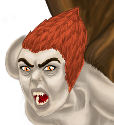
The orange seemed like a good choice because it's in the same area as the brown which I used for the wings.

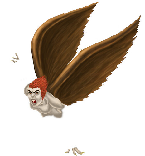
That being said, I wasn't too sure about the skin tone. I liked the general look, but she almost seemed to human, not quite weird enough for my purposes.

Harpy 4

Playing around with hue and saturation on the skin layer, I came to this blue/grey colour which seemed to be pretty interesting, and had higher contrast, which I love. After showing it to another design friend of mine, I'm now debating whether or not I will keep it this colour or not.

-Edit-

After playing around with everything I decided it would be best to just add more shading to the darker areas using a purple hue, so I scrapped the blue hue.

darker skin

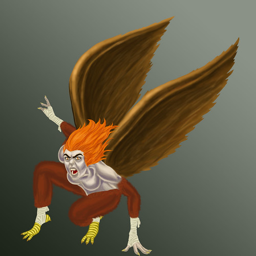
My next step was to add in the feathered arms and legs

arms/legs

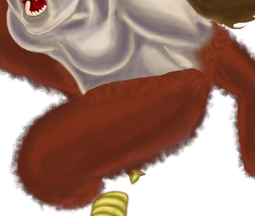
After adding in the layers of colours and blending them as I did with the skin, I used a feather brush to create that wispy look of feathers, especially around the hips, ankles, wrists and upper arms.

bandages

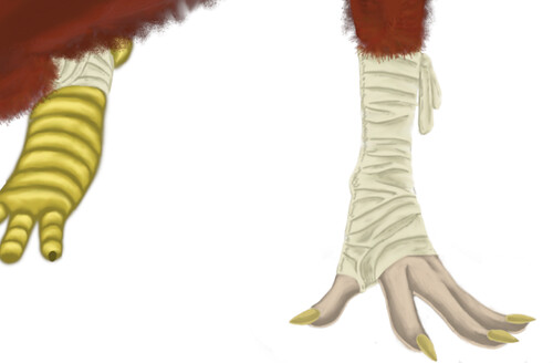
Next I added in the bandages on her ankles and wrists. I put down a pale off white colour, followed by a darker shade of the same colour to give the look of shading. After that I blended the colours to smooth them out, followed by yet a darker shade of that same colour on the edges and lines separating the bandage pieces.

hair

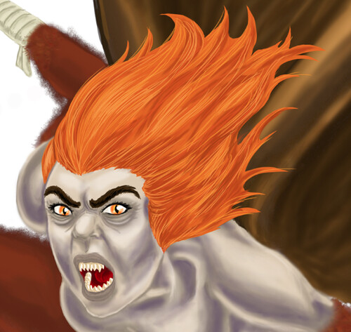
I then continued on to the hair. I had some comments from friends and family that the style I had originally put on her looked like a pine cone, and was too uptight and put together, so I re-did the hair in a flowing, wilder style. To create the look of her hair I first put down the medium orange colour in the overall shape of the hair. After that I added a darker shade of orange for the low-lights and I blended the two together. I followed this with a much lighter shade for highlighted strands made with a 2 point brush to be evident as separate pieces of hair. Finally I placed almost white strands as shines and super-highlighted pieces of hair, isolating them to the points where I thought the light would be strongest.

Talons

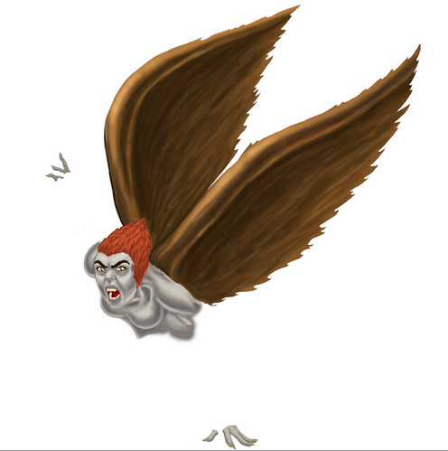
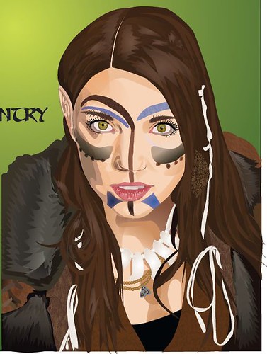
Finally I went to the toes and added in the talons. I painted on the dark brown colour, followed by the golden colour and the highlights. I blended all of them together and finished with what you see above. Then a green background with a gradient, just so there is enough contrast to see everything but not so much of a background to detract from the focus.

And here is my final product of a Harpy lady. She took me a couple months to finish, but I believe she is well worth it. I am very proud of this image :)

Harpy-Finished

“Humans had a saying. Mess with the bull and get the horns. Well, Harpies had a saying, too. Mess with a Harpy and die.” ― Gena Showalter, The Darkest Surrender

Sunday, January 27, 2013

Ocean Illustration

I've started working on some concept art with the inspiration of the word ocean. Although it's not done yet I thought I would post my work in process.

The medium used was Acrylic paint on Illustration board, primed with Gesso.

I feel it's important that I start by saying my phone's camera made the brown look much more orange than it is in person.
Illustration Ocean Theme part 1
My first step was to map out the land from the water, I knew I wanted a worms' eye view kind of angle, so I made sure to make a kind of 'V' shape with the blue of the water towards the sky.
Illustration Ocean Theme part 2
Next was to start adding depth to my terrain, so I added a darker shade of brown to show shading.
Illustration Ocean Theme part 3
Once I had started the shading it I worked on making a more obvious contrast between the light and dark by including white and dark grey with my mixed paints. This turned out fairly well in my opinion.
Illustration Ocean Theme part 4
Once I was fairly happy with the progress I had made in the landscape I decided to start working on the mini submarine.
Illustration Ocean Theme part 5
After adding in a bit more work on the mini sub and including an octopus plus some schools of fish, I decided to let my painting have some time to dry and my eyes some time to rest. This is my progress after about 2 and a half hours, starting at 7pm and wrapped up at about 9:30.
More progress on my Ocean Themed Illustration.
Illustration Ocean Theme part 6
And after adding a few more details....
Illustration Ocean Theme part 7
And I am done the painting aspect of this project. Once I've given it some time to dry I will continue adding detail with pen and possibly coloured pencil.

That's all for tonight! So I'll end with another beautiful quote

"Nothing is impossible, the word itself says 'I'm possible'! " -Audrey Hepburn

Monday, January 14, 2013

Elf Made Vector

My first image upload. This is a screenshot of an image I created in CorelDraw. The model is myself in my LARP costume. This image was done as a promotional piece for an event. Vector Elf Image
My character is named Sorcha Darkwood, and she is an adept wild elf. I LARP with Nero Canada with my best friend Danni. Nerdiness has never been an issue for me.
The eyebrows are a little wonky, but overall I think I did a decent job on this image.
The original but retouched photo I worked from is slightly different, but still pretty fun. Elf Girl Original-retouched
And here is a comparison of my original camera raw picture against the photo retouched image that I worked from. The Comparison
I'm not one for pictures of myself really, but most of my friends are camera shy, and I think this picture looks pretty nice.

Here is the first in hopefully a long series

Good morning all!

Here is my first blog post ever on this site. I intend to work on my illustration and design skills and to update on this blog as I go. My ultimate goal at this point is to eventually become a concept artist, preferably for video games.

In high school I never took any art classes or had any lessons. Since starting the graphic design course at Mohawk in September 2011 I have had my first tastes of actual art lessons. I've started working with paint for the first time in my life, so I'm not very good yet, but intend on honing my skills. I'm also working with digital art for the first time, and am still working on perfecting my Photoshop skills.

I love landscape art, and tend to have some beautiful landscape concepts on my desktop background. I also really love Steampunk, as well as burlesque and pin up style. 

This year I will be graduating from Mohawk College, provided I meet the requirements of course. Continuing my education in design and illustration is very important to me, but more in practice than actual schooling.

This is what I will end with for my first post. Thanks for reading!

"Not all those who wander are lost." -Tolkien